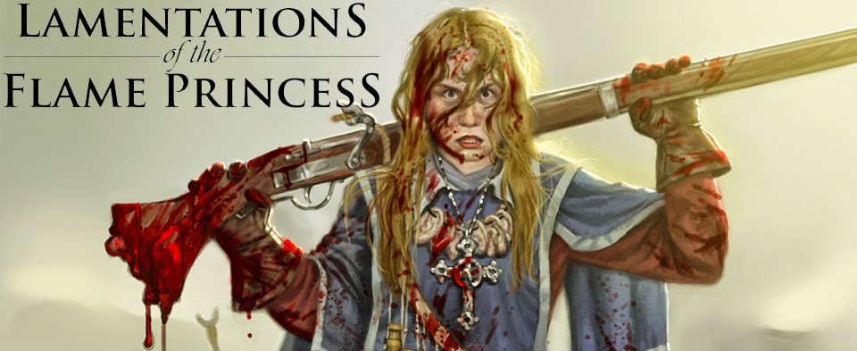
I like it very much. The olden domain font fits in with rest. It and the red lettering pop/draw attention. And there's a dude with a sword and some ball thing with an eye? wtf is that? Makes me want to contact this guy and find out.
Don't think it'd look horrible as straight up BW either.
nitpick: the "for more information ..." is unneeded and imho clutters up the design.
I agree that the "for more information .." is superfluous. I am curious, where are you going to post these? The university? or are there relevant game stores in Helsinki?
>>I think it would look better if you could centre the words "Mystery", "Terror" and "Magic".
I did it this way because it makes the whole thing more symmetrical. I'm sure nobody's going to ignore the flyer because it's got a hole in the middle. :D Same thing with the "for more information" thing. Doesn't hurt to have it there, and it just looks a bit funny if it's announcing something yet doesn't extend any sort of invitation...
>>I am curious, where are you going to post these? The university? or are there relevant game stores in Helsinki?
There's one game store, but their notice board is behind a stuffed animal rack. Schools are a good idea... hadn't thought of that.
On Monday we're off to post these in libraries and grocery stores, at least the ones with public bulletin boards. I want 50 up by the end of the week.
The problem is that it doesn't look symmetrical, though. The text is much denser and an entirely different colour to the fighter, and honestly it just looks as though its been misaligned. Try centring the text and reformatting the art to be either side of it.
Admittedly, this does mean that the fighter won't be looking at the beholder anymore, but I suspect that most people will just assume they're separate pieces of art.

I like it. Is it going to kill your printer though?
ReplyDeleteNot so much. I hope.
ReplyDeleteThis is the best one yet, although I think it would look better if you could centre the words "Mystery", "Terror" and "Magic".
ReplyDeleteI like it very much. The olden domain font fits in with rest. It and the red lettering pop/draw attention. And there's a dude with a sword and some ball thing with an eye? wtf is that? Makes me want to contact this guy and find out.
ReplyDeleteDon't think it'd look horrible as straight up BW either.
nitpick: the "for more information ..." is unneeded and imho clutters up the design.
I agree that the "for more information .." is superfluous. I am curious, where are you going to post these? The university? or are there relevant game stores in Helsinki?
ReplyDeleteOh, and yes I like this one best of them all.
ReplyDelete>>I think it would look better if you could centre the words "Mystery", "Terror" and "Magic".
ReplyDeleteI did it this way because it makes the whole thing more symmetrical. I'm sure nobody's going to ignore the flyer because it's got a hole in the middle. :D Same thing with the "for more information" thing. Doesn't hurt to have it there, and it just looks a bit funny if it's announcing something yet doesn't extend any sort of invitation...
>>I am curious, where are you going to post these? The university? or are there relevant game stores in Helsinki?
There's one game store, but their notice board is behind a stuffed animal rack. Schools are a good idea... hadn't thought of that.
On Monday we're off to post these in libraries and grocery stores, at least the ones with public bulletin boards. I want 50 up by the end of the week.
I like it! I'd cut "A Land of" altogether.
ReplyDeleteThe problem is that it doesn't look symmetrical, though. The text is much denser and an entirely different colour to the fighter, and honestly it just looks as though its been misaligned. Try centring the text and reformatting the art to be either side of it.
ReplyDeleteAdmittedly, this does mean that the fighter won't be looking at the beholder anymore, but I suspect that most people will just assume they're separate pieces of art.